
On
Aug 7, 2025, 8:36 AM
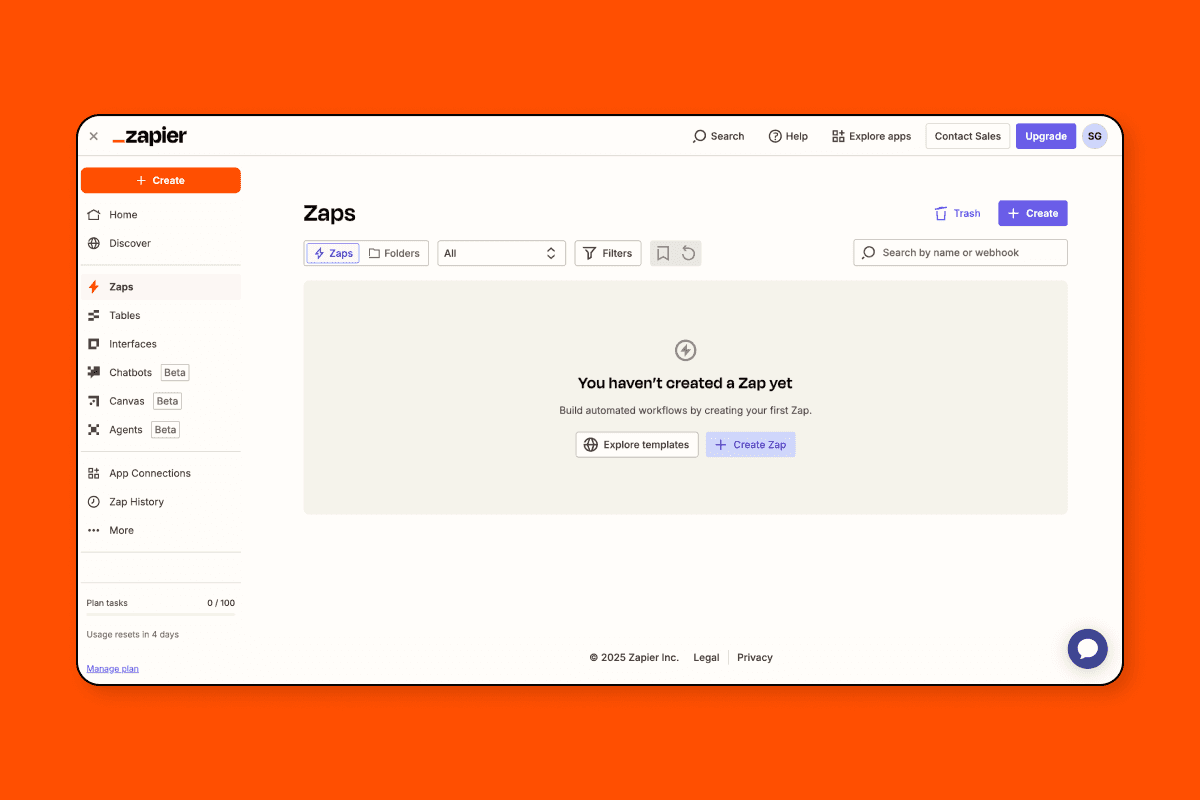
Empty states are usually treated as blank slates or placeholders. Zapier treats them as high-leverage conversion surfaces. From the first second of a no-data experience, users are educated, reassured, and nudged toward action — without any annoying tours or overlays.
Let’s break down how they do it.
Warm Welcome, Not a Dead End
Takeaway: Your first impression isn't just UI — it’s emotional posture.
Clear headline sets expectation (“You haven’t created any Zaps yet — let’s change that”)
Supportive tone, not accusatory
Zero guilt, maximum invitation
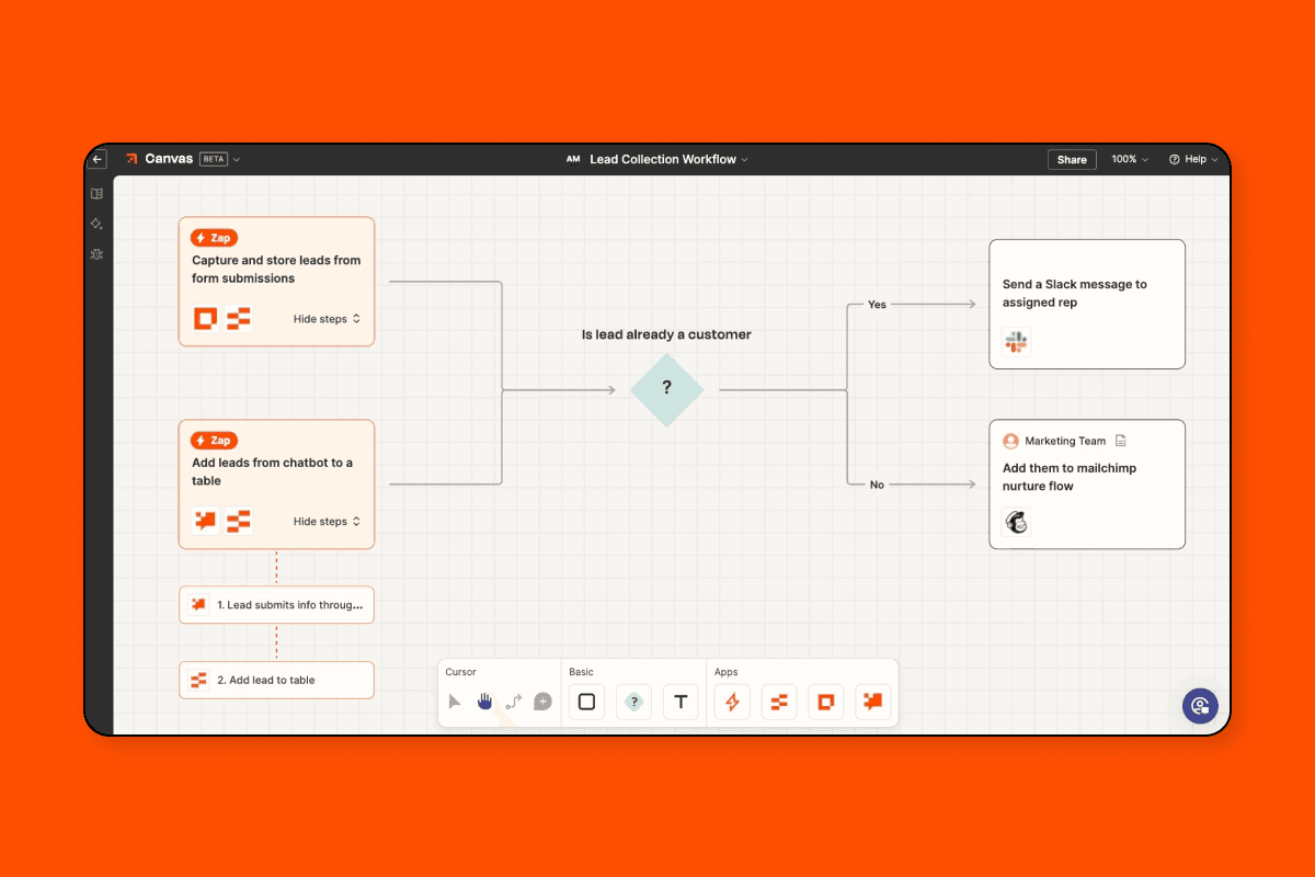
Contextual Education Without the Tour Fatigue
Takeaway: Teach through context, not instruction. Familiar tools lower the mental lift.
Visual example of what a Zap could look like
Popular use case based on common tools (e.g., Gmail to Slack)
Shows output first, then method
Call-to-Action is Clear — and Calming
Takeaway: CTAs should reduce friction and increase confidence. Both are design challenges.
Button CTA is affirmative, not pressure-y
Subcopy (“No coding required. We’ll guide you.”) eases uncertainty
Action feels like a choice, not a demand
Microanimations Guide the Eye Subtly
Takeaway: Visual motion should whisper direction — not shout for attention.
Visual cues like arrow winks or gentle pulse to guide first click
Nothing auto-plays or overwhelms
Animations serve progression, not flair
Onboarding Disguised as Progress

Takeaway: Blur the line between learning and doing — that’s where confidence compounds.
Fields are not empty — they include ghost text or examples
Help text feels embedded, not external
User feels like they’re building, not learning