
On
Jul 21, 2025, 5:29 AM
Developer-first products often overload users with tabs, docs, and toggles. GitHub avoids that trap by designing navigation that thinks like a developer. This isn’t just about tabs — it’s about reducing mental load and keeping focus razor-sharp.
Let’s break down the subtle UX choices that make GitHub feel fast, familiar, and frictionless.
Context-Preserving Side Navigation
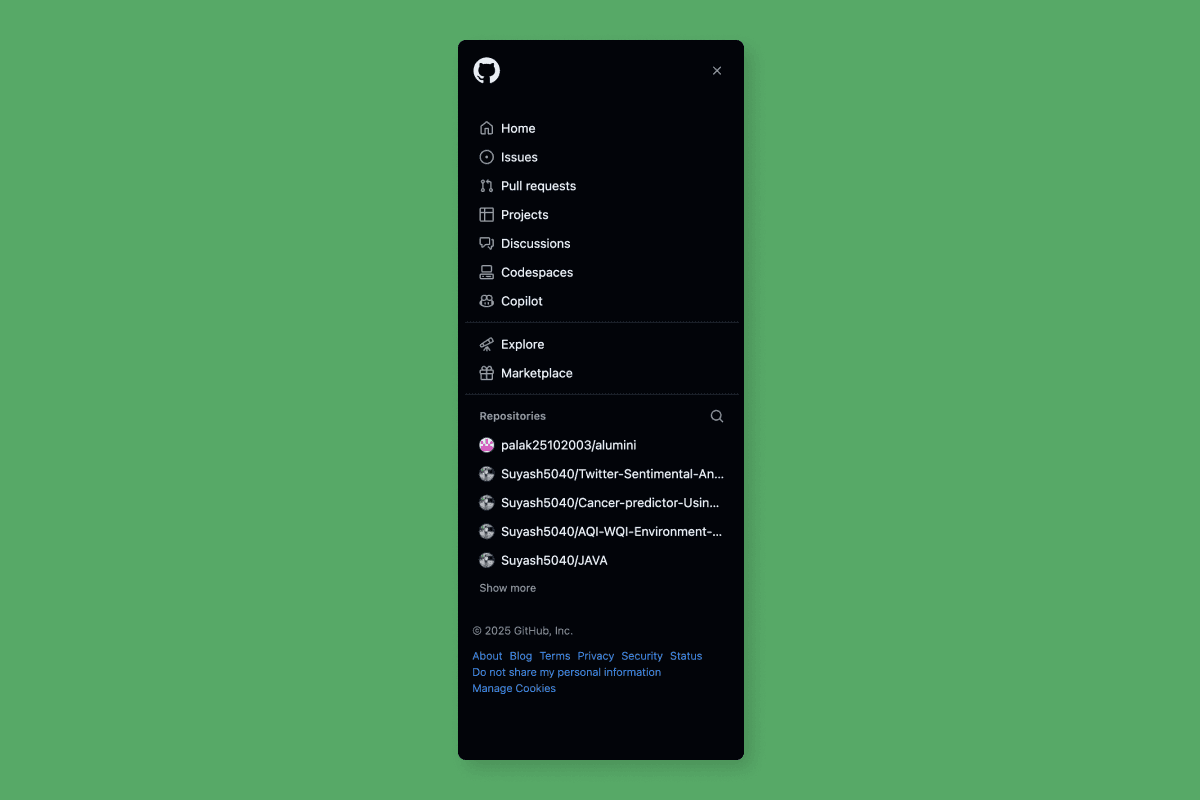
Takeaway: Builders hate re-finding where they were. Let them stay grounded.
Keeps project-level context always visible.
You can switch between Issues and PRs without losing your place.
Anchors your workflow within the repo — not across the platform.
Minimal Top-Level Tabs, Maximum Clarity
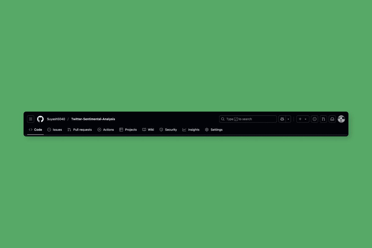
Takeaway: Fewer choices = faster cognition.
No overstuffed nav. Just what matters, when it matters.
Top nav is clean and purpose-driven, not a sitemap.
Uses icon hierarchy and spacing to separate utility from exploration.
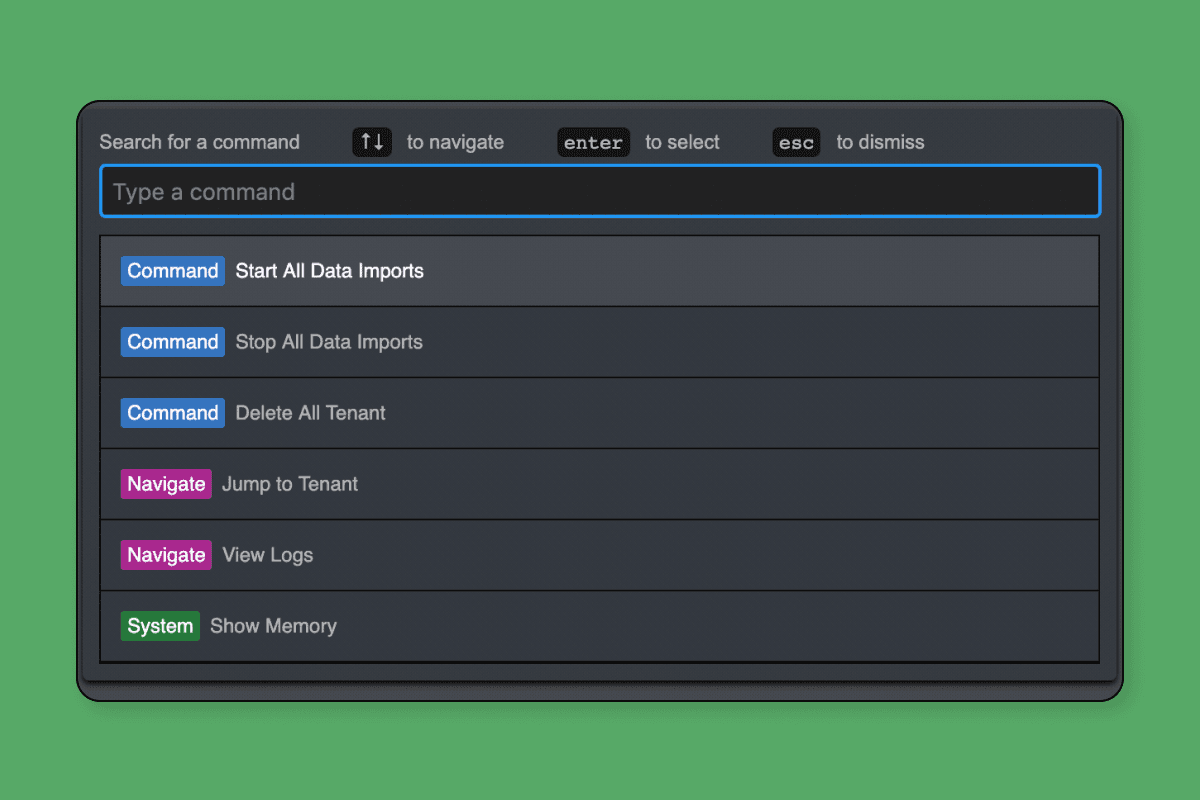
Fast Switcher with Keyboard Power
Takeaway: Keyboard-first UX isn't niche — it's velocity UX.
Jump to any repo, branch, or page with a few keystrokes.
Mirrors developer IDE behavior — familiar muscle memory.
Power feature that's discoverable but doesn’t clutter UI.
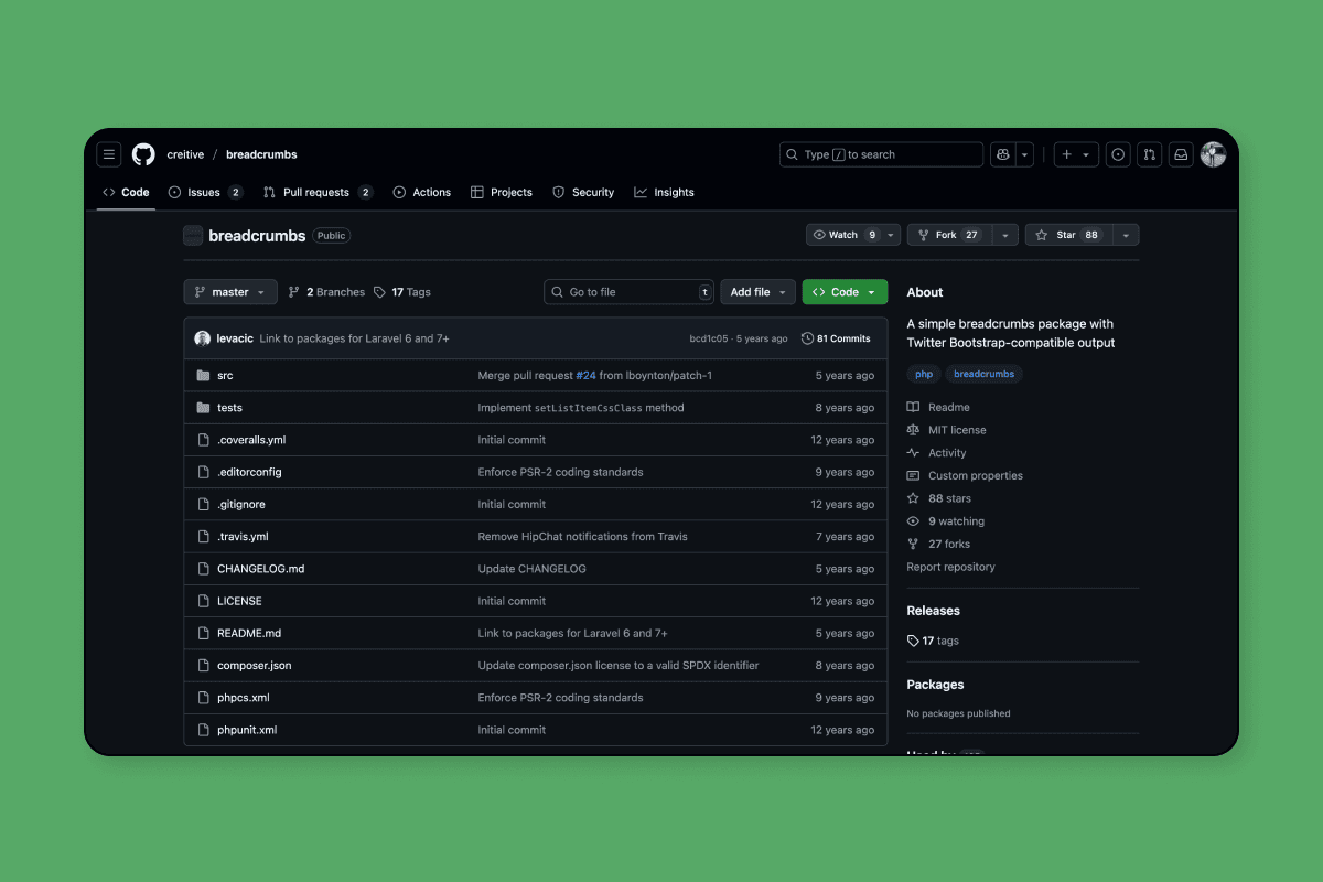
Breadcrumbs + Branch Awareness
Takeaway: In dev tools, version ≠ location — show both.
GitHub always shows where you are and which version you're in.
Easy to navigate folders without guessing.
Versioning UX is not an afterthought — it’s built in.
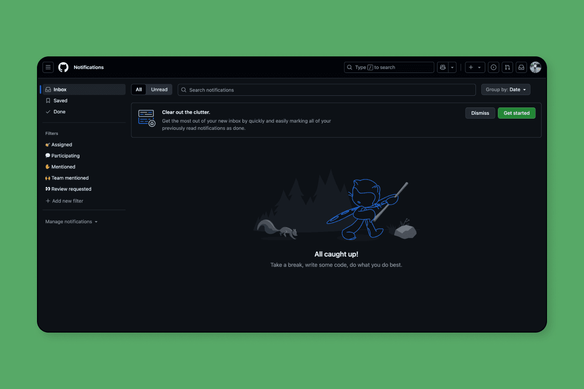
Notification Centered, Not Distracting
Takeaway: Good nav filters signal from noise by default.
Alerts are there, but don’t scream for attention.
Prioritizes relevance — only important changes show.
Keeps focus on the code, not the noise.