
On
Jul 21, 2025, 5:29 PM
Linear doesn't just look sleek — it feels like you're productive the second you land. Even before you create a project or task, the product primes your brain to feel clarity, momentum, and speed.
Let’s dissect the psychology and UX patterns behind that magic.
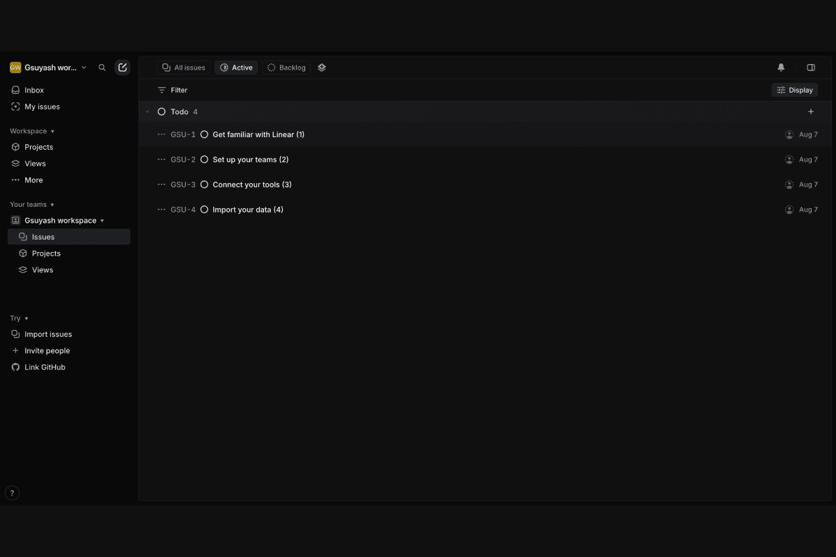
Instant Structure, No Setup
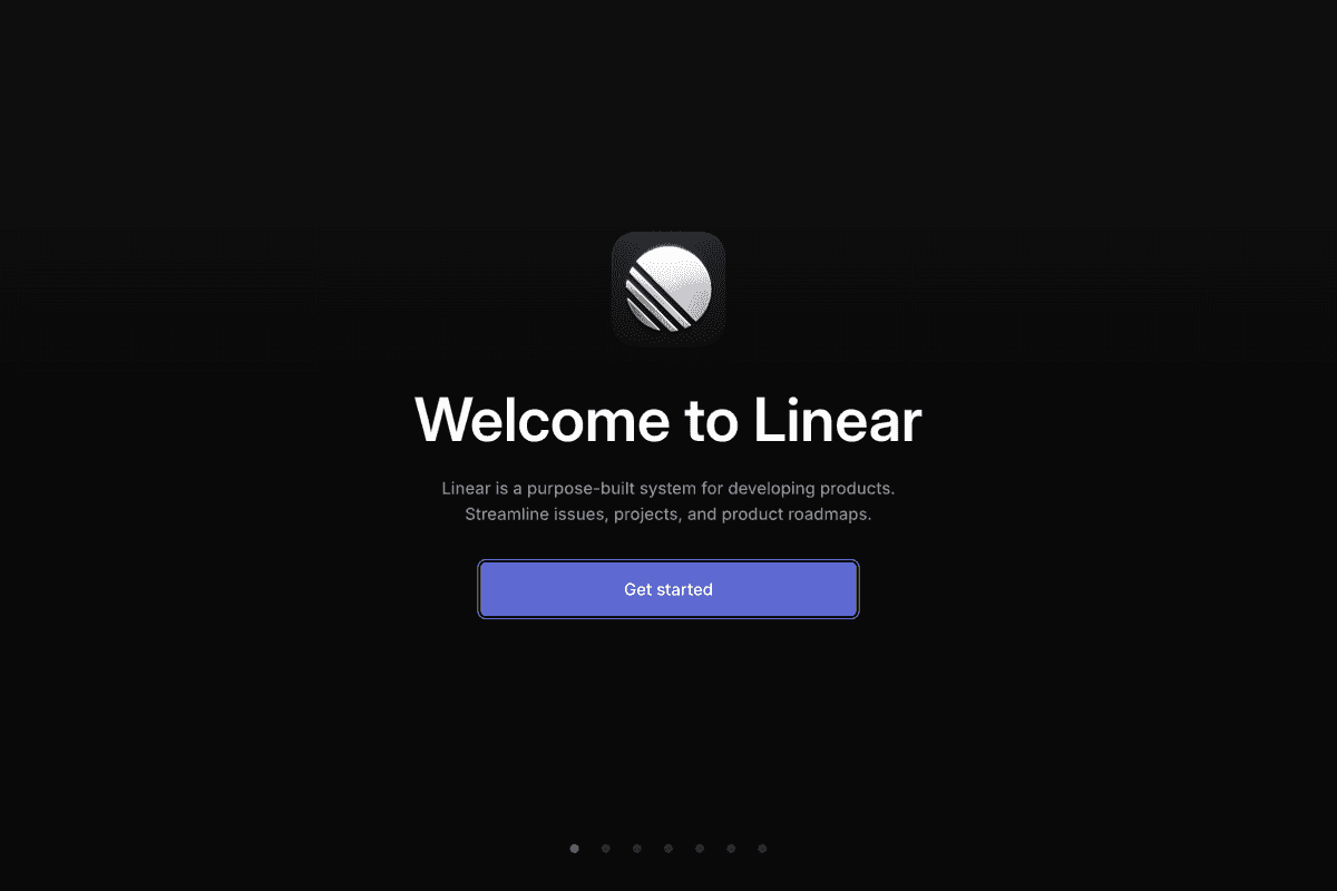
Takeaway: Remove friction, not control. Give users a head start.
Auto-generates a project, workspace, and dummy issue.
No "blank state anxiety".
Reduces decision fatigue right from step one.
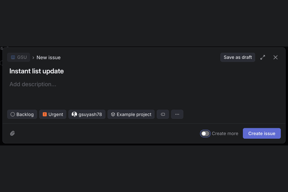
Keyboard-First Design, Nudged Early

Takeaway: Empower users quickly — even if they only use 10% of features.
Introduces keyboard shortcuts within 30 seconds.
Command bar gives superpower vibes, not complexity.
Helps users feel “tech fluent” without onboarding videos.
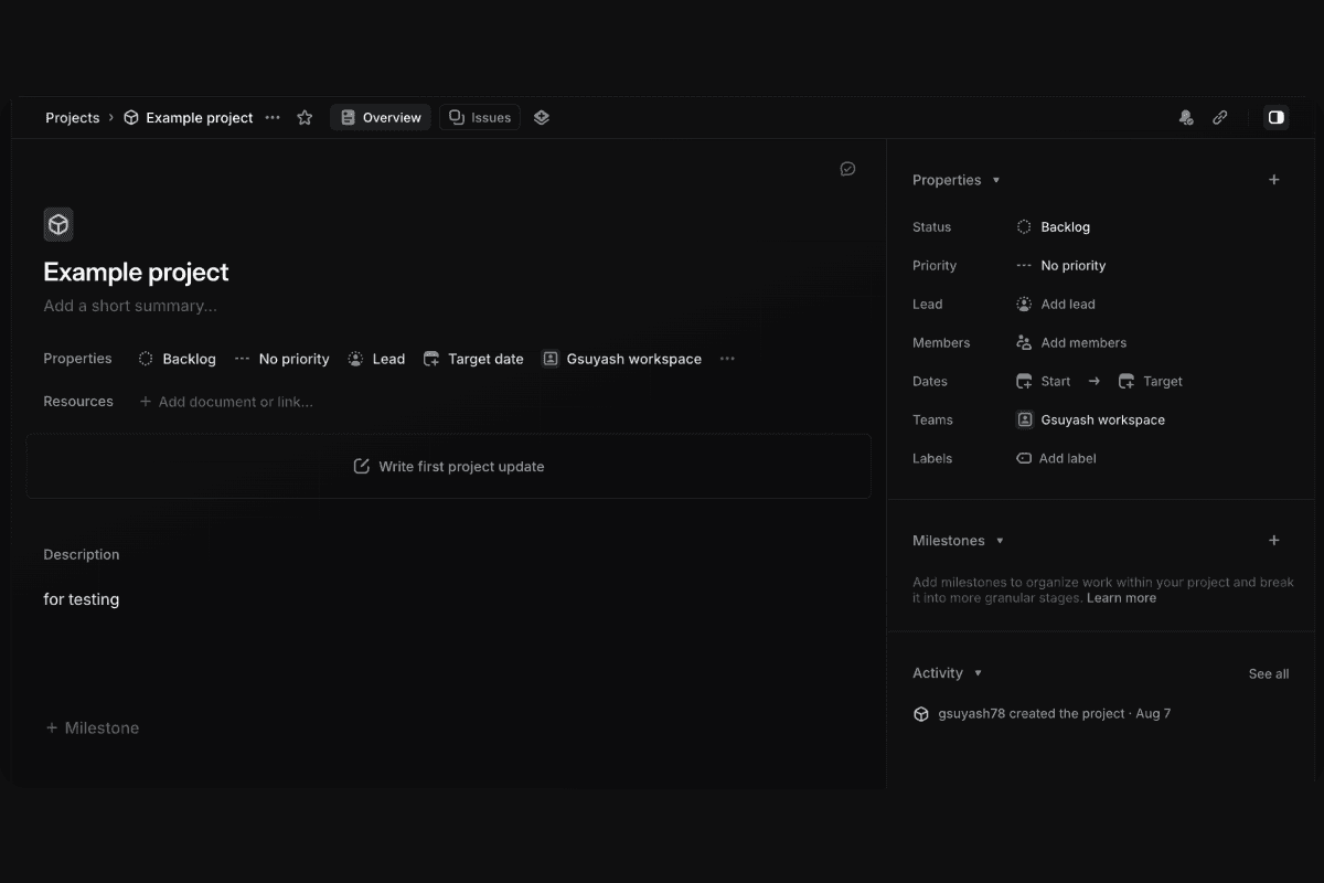
Visual Focus and Calm
Takeaway: Great onboarding = visual psychology, not just tooltips.
Minimal UI noise. Faint separators. Generous padding.
Smart use of whitespace to reduce overwhelm.
Everything looks “ready to go” — even with no data.
Auto-created Dummy Tasks with Editable Copy
Takeaway: Teach by interaction, not instruction.
Dummy task is already present: “Drag me anywhere”
In-line editing teaches affordance without guides.
No forced walkthroughs — just clean, discoverable behavior.
Consistent Velocity Feedback Loops
Takeaway: Momentum is a design feature, not just a UX outcome.
Instant animations, subtle toasts, and responsive UI.
Every action feels like progress — even small ones.
Encourages flow state from day one.