On
Jul 21, 2025, 5:29 PM
Vercel’s pricing page isn’t just clean — it’s strategic. It earns trust, drives urgency, and nudges upgrades — all while feeling developer-first and frictionless.
We broke it down screen-by-screen to see how.
Clarity Over Complexity
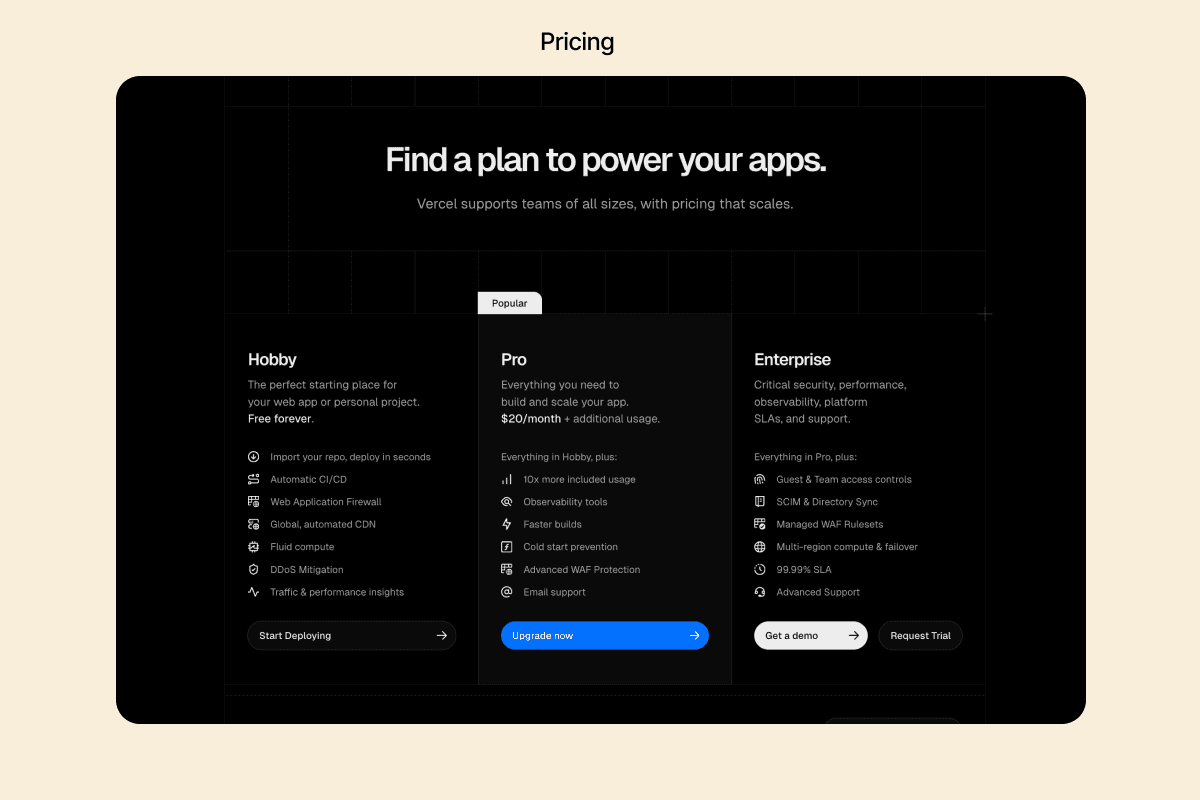
Takeaway: Use simplicity to reduce conversion hesitation. Especially on pricing pages.
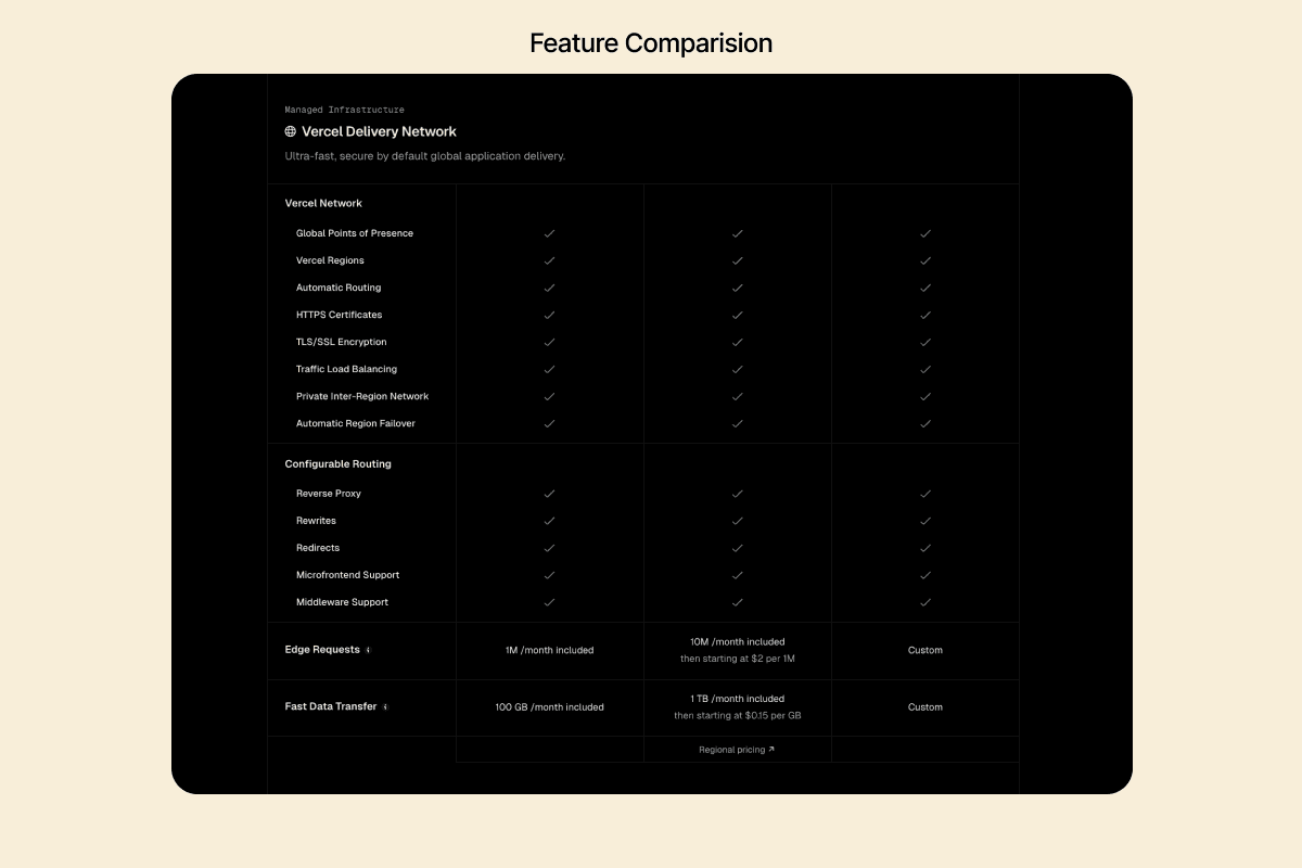
Clear plan names (“Hobby”, “Pro”, “Enterprise”) — avoids jargon.
Uses 1-line descriptors and icons for instant scanning.
CTA buttons mirror user mindset: “Start for Free”, not “Sign Up”.
Urgency With Integrity
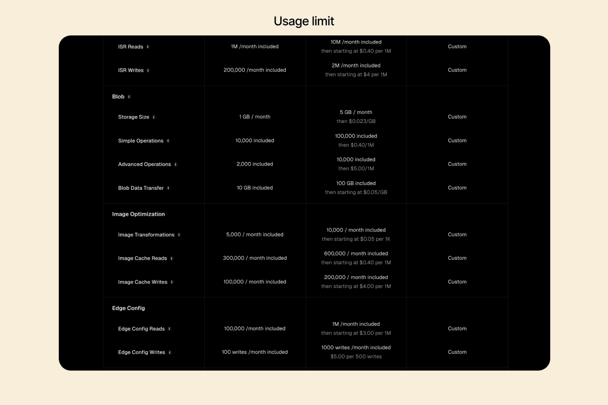
Takeaway: Create urgency with UX, not popups. Let metrics speak.
Highlights soft usage caps in yellow — “Approaching limit” nudges users upward.
No aggressive lockouts. Just visibility and suggestion.
Progress indicators show transparency — not pushy, but proactive.
Enterprise Reassurance Without Friction
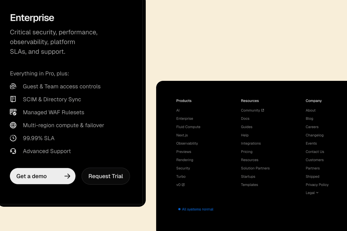
Takeaway: Earn enterprise trust without alienating smaller customers.
“Talk to Sales” CTA is present, but not dominant.
Detailed security, uptime, and compliance info builds trust.
Placement in the footer keeps the page welcoming to startups.
Plan Differentiation by Use Case, Not Features
Takeaway: Sell based on value, not just volume.
Instead of endless checklists, it highlights outcomes: “Collaborate with teams”, “Unlimited
environments”, “Role-based access”
Grouped features under real-world categories (teamwork, security, performance).
Microcopy That Feels Human, Not Corporate
Takeaway: Microcopy is your silent closer. Use it with empathy.
“You can always downgrade later.” → reduces FOMO friction.
“We’ll email before billing.” → proactive, not sneaky.
Tooltips add clarity, not confusion.