
On
Aug 8, 2025, 8:58 AM
Blinkit doesn’t just deliver groceries — it delivers urgency with confidence. Every screen, interaction, and nudge is shaped to remove doubt, reduce steps, and reinforce speed. It’s not about browsing — it’s about buying fast, and feeling sure.
Let’s decode how Blinkit makes urgency feel effortless.
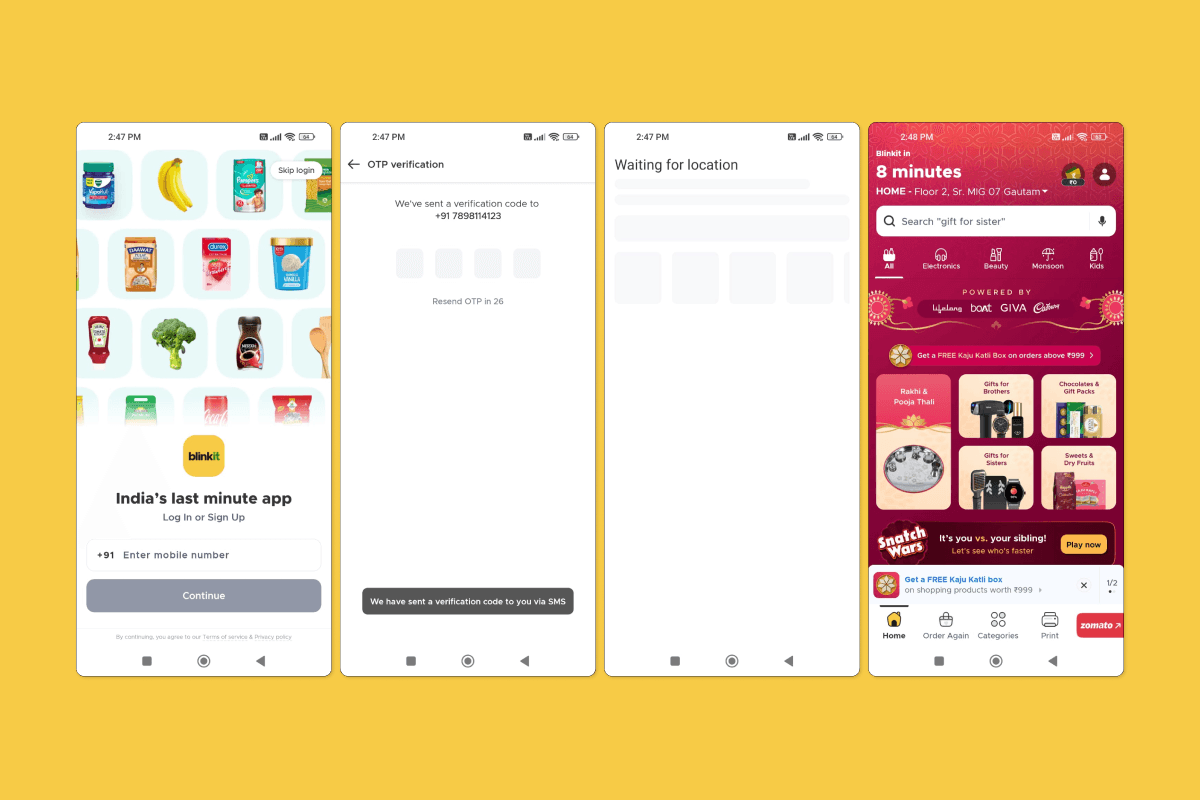
Location Locks the Experience
Takeaway: Hyperlocality isn’t a feature — it’s the foundation.
Onboarding asks for location upfront
Product availability, delivery slots, and offers change by pin code
Smart use of maps, ETA, and “Delivering to [You]” headers
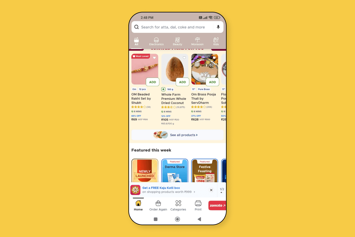
Homepage Prioritizes What’s Urgent
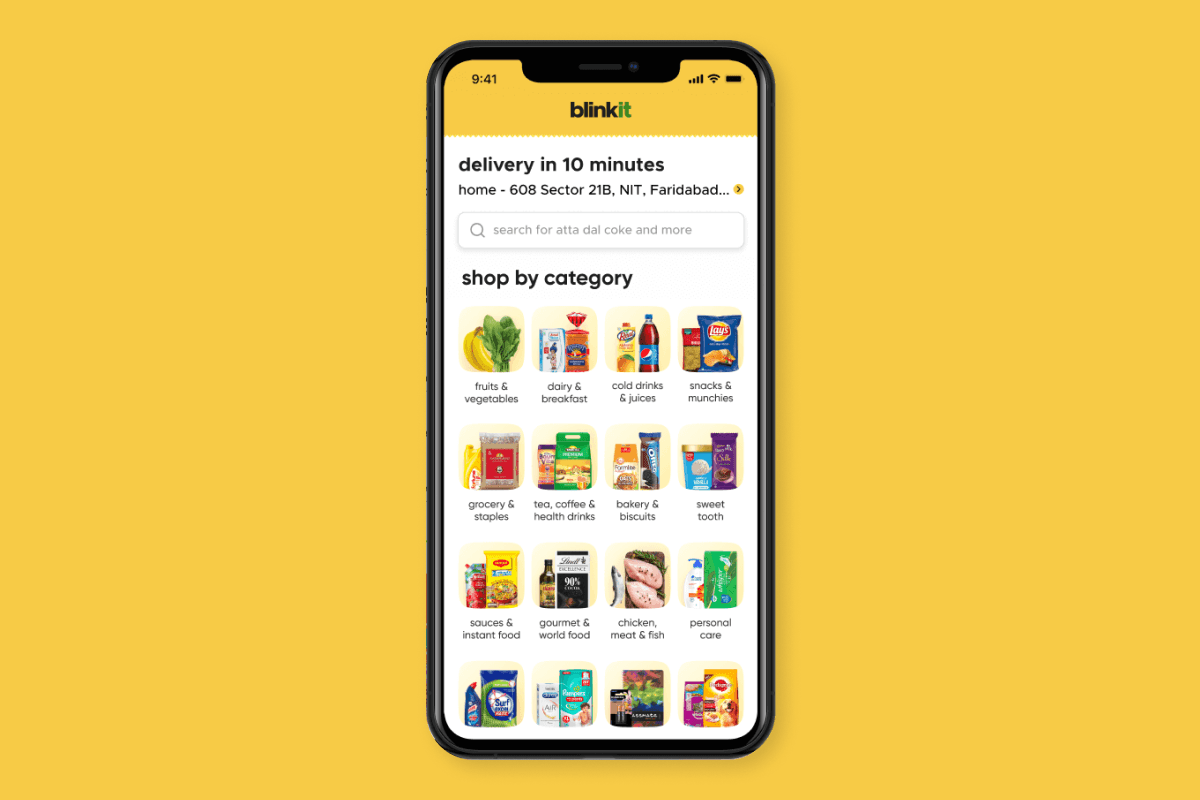
Takeaway: You don’t explore — you act.
Hero banners for popular essentials (milk, veggies, staples)
Quick links to frequent categories
Search bar emphasized more than scroll
Cart is the Real-time Control Center
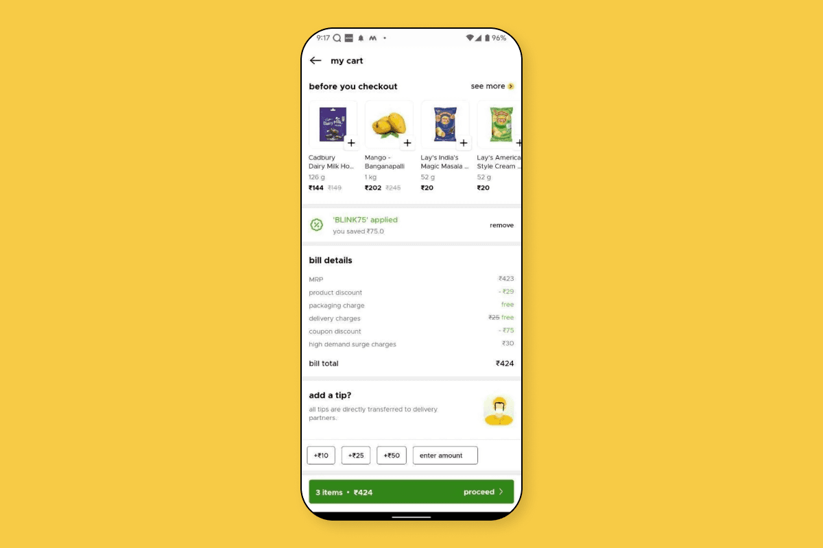
Takeaway: Cart isn’t passive — it’s part of the decision-making loop.
Live price tally and estimated delivery time
Smart nudges (“₹10 away from free delivery”)
Add-ons and item swaps based on stock availability
Microinteractions That Reassure
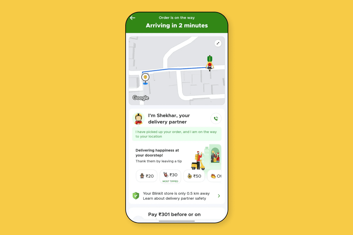
Takeaway: Every tap feels instant and confirmed.
Add-to-cart animations are fast and visual
Progress bar from order placed → packed → out for delivery
“Rider is 3 mins away” cards calm post-checkout anxiety
Trust Signals Everywhere
Takeaway: From pricing to delivery, it feels reliable.
Product reviews, replacement guarantees
“Most ordered in your area” tags
Consistent pricing, even in emergencies